With the advent of modern CSS properties, technologies, and tools, it's become easier for web developers and designers to create beautiful and flexible web designs using just as few lines of code as possible.
One of those modern properties is Gap.
In this guide, I'll explain what it is and how it can be used in your day-to-day web design while giving you some insights and practical examples.
Let's get started.

An Overview of All the Gap Properties
Here's a complete list of all the gap-related properties.
gaprow-gapcolumn-gapgrid-gap(deprecated - alias ofgap)grid-row-gap(deprecated - alias ofrow-gap)grid-column-gap(deprecated - alias ofcolumn-gap)
The first three properties are the standard Gap properties and the ones you should be using.
The rest of the three grid-* properties are deprecated. While some browsers may still support them due to legacy reasons, it is NOT recommended to use them at all.
Let's dive into their details.
What Is Gap?
The gap creates gutters or spacing around the website elements or items.
It's a shorthand for row-gap and column-gap, which creates gutters for both the rows and columns (horizontally and vertically).
What Is grid-gap?
You might have heard of it before and wonder what it is about. In fact, judging from its name, you might even think it's used only for grid containers.
No. It's actually the same as gap and nothing more than an alias. And it works for flex and multiple columns as well.
What Is row-gap and column-gap?
As you can imagine, row-gap allows you to create horizontal space between the rows.
While column-gap allows you to create vertical space between the columns.
How Do You Use Gap in CSS? What Is the Gap Syntax?
Here's the gap syntax.
gap: <row-gap> <column-gap>;
Gap supports all CSS units to specify the value, be it pixels, percentages, REMs, EMs, etc.
Creating a Simple HTML Web Page with CSS Grid
Let's create a simple web page to see it in action.
Step 1 - Add the HTML Code to the Website
Launch your preferred source code editor like VS Code.
Create a new file and add the following HTML code.
<!DOCTYPE html>
<html lang="en">

<head>
	<meta charset="utf-8">
	<title>CSS Gap Property in Action</title>
	<meta name="viewport" content="width=device-width, initial-scale=1.0">
	<link rel="stylesheet" href="./index.css">
</head>

<body>

	<main>
		<section class="container">
			<p class="paragraph-first">This is an example paragraph that is longer than the other one.</p>

			<p class="paragraph-second">This is another paragraph.</p>
		</section>
	</main>

</body>
</html>
Save the file as index.html.
Step 2 - Add the CSS Code to the Website
Next, add the following CSS styles in a new file.
body {
  margin: 0;
  padding: 5rem;
}

.container {
  display: grid;
  grid-template-columns: auto 1fr;
  gap: 1rem;
}

.paragraph-first,
.paragraph-second {
  padding: 1rem;
  border-radius: 8px;
}

.paragraph-first {
  background-color: hsl(120, 100%, 90%);
}

.paragraph-second {
  background-color: hsl(240, 62%, 90%);
}
Save the file as index.css in the same location as your index.html.
Step 3 - Inspecting the Website
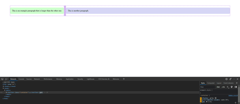
Open the index.html file in your web browser, and you should see that you have two different boxes with some space between them.
One box with a green background color on the left, and the other with a purple background on the right.

Open browser DevTools (usually the F12 keyboard shortcut on most browsers).
You'll notice we've used gap: 1rem; here. This gap CSS property sets the gutters between grid rows and grid columns to be 1rem (equal to 16px by default).

Note
Notice that the green box is smaller than the purple one. This is because we've set the green box to take as much space as needed to fit its contents using the auto value in grid-template-columns.
If you want both boxes to take up equal space, you can simply use 1fr instead of the auto value.
What Sets Gap Apart from Margin or Padding Spacing?
One of the biggest perks of having the gap is the ability to simply define the equal spacing between the site elements. This saves you the time to manually calculate and adjust margins or paddings.
The other benefit is that you don't have to give each child item a separate gap. Instead, you simply set the gutter on the parent container.
Pros of Gap
Honestly, there are many benefits of using Gap over margin or paddings. I've mentioned some of the important benefits below.
- You don't have to worry about responsive web design. Gap works flawlessly on every device, desktop, tablet, and mobile phone.
- No more messing around with JavaScript complexity to control the width, height, or position of inline elements to adjust the margins or paddings.
- And certainly, no need to worry about negative margins, calculated specific paddings or margins, and whatnot to create the perfect spacing for your websites.
Cons of Gap and When to Use Margins or Paddings
To be fair, there isn't much drawback to it, except for the following cases.
- If you need to set some space on an nth-child or the last element only. That's where the padding or margin works the best.
- Want to create a unique layout where a box has different spacing between the items? Consider using margins or paddings here.
Unlike with Gap, you can set margin-top, margin-right, margin-left, or margin-bottom on selective elements individually as per the need.
Use Cases of Gap
You can use it on almost any website, web app, or component. Below are a few use cases for it.
- You could specify gutters between grid rows if you have a website with vertically stacked items using a Grid layout.
- Want to create a list of several boxes with equal spaces between items? A gap is an ideal choice here.
If you want to see some practical examples, most of my web projects use almost always gaps for spacing. I only use margins on rare occasions.
FlexStart is a great example of that. Inspect the website and notice how it uses gaps everywhere.
Browser Support for Gap
According to Can I use, Gap is supported up to 96.15% as of writing this article.
All the modern versions of major web browsers, including Mozilla Firefox, Google Chrome, Microsoft Edge, and Apple Safari, fully support it.
Older browsers such as Internet Explorer don't support it. That's something to keep in mind if you plan to create websites especially for them which is highly unlikely nowadays.
Gap Can Only Be Used on CSS Flexbox, Grid Displays, and CSS Multi-Column Layouts
Unlike margin or padding, which can be used on any HTML tag, the gap does NOT work on any element that is not a Flexbox, CSS Grid container, or a multi-column layout.
Your parent element must contain either display: flex;, display: block;, or the column-count property to use gap.
It means you need an additional wrapper or container to wrap the elements inside.
Browser Support for Flex Container, Grid, and Multi-Column Layouts
Because Gap can only be used on certain display types, it's important to know whether they are also supported by modern browsers.
According to Can I use, the global usage count of all three layout types as of writing this guide is as follows.
- The column-count property is supported up to 97.07%.
- CSS Grid is supported up to 97.56%.
- Flexbox is supported up to 98.14%.
CSS Frameworks Support for Gap
All popular CSS frameworks, such as Bootstrap, Tailwind, and Bulma, support Gap.
So, if you're using a CSS framework to create a website, you should look up its documentation to see the usage syntax and more info on how to use it.
Can I Safely Use Gap on the Websites?
Generally speaking, yes.
You can safely use it on all your websites without fearing your website breaking for anyone using any browser or device.
However, if you know that your website will have an audience that uses a browser or device that doesn't support these modern technologies, then I'd advise against using it on that website(s).
For instance, Internet Explorer doesn't support Gap at all. Therefore, if you know that a large portion of your website audience includes IE browser users, then it's best not to use Gap on your website.
Conclusion
I hope this article has given you some insights on Gap.
And hopefully, I could shed some light on why you should use it over margins or paddings when possible.
Be sure to subscribe to the W3Things newsletter to receive all these helpful insights and more in your inbox.
Frequently Asked Questions About Gap
Can I use Gap with Flex? Does Gap Work with Flex?
Yes, Gap works with Flex containers.
How Do I Make Gaps Between Items in Flex? How Do You Put Space Between Flex Items in CSS?
Simply use gap with any value such as 1em, 10px, 30px, etc. with display: flex; on the parent container.
How Do You Make a Gap in CSS Grid?
You can make a gap in CSS Grid the same way as with Flex gaps.
Simply define a gap of any value you want to add to your grid items, such as gap: 5px; or gap: 2rem;.
For a detailed guide on making a gap in CSS Grid, follow the instructions in the guide above.
Additional Resources
Please refer to the following articles if you'd like to learn more about the properties, technologies, or concepts mentioned above.
- CSS Grid: Understanding grid-gap and fr vs. auto units (Source: Rawkblog)
- CSS values and units (Source: MDN)
- Gutters (Source: MDN)

