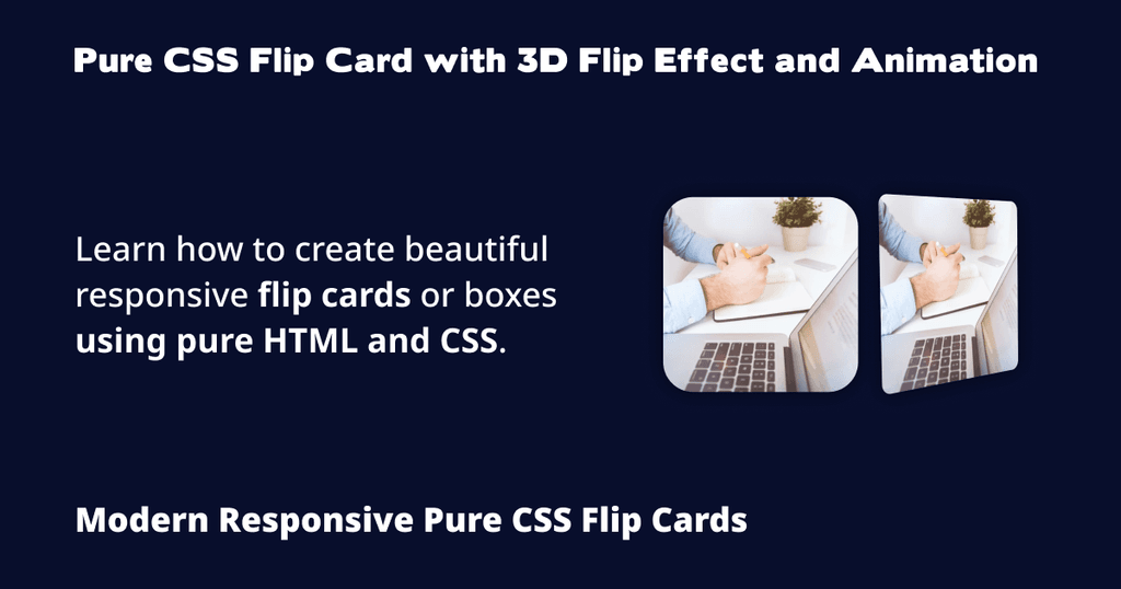
Flip Cards or Flip Boxes are popular for creative web designs to showcase something. It might be an e-commerce product card, an item listing, or other informational content.
In this beginner's tutorial, we'll learn how to create flip cards with a 3D flip effect and animation using pure HTML and CSS.
Let's get started.

What Is a 3D Flip Card?
Generally, a 3D flip card has a front and back side.
There's usually some content (say, an image or a video) on the front of the card.
When a user hovers over it, it rotates or flips in a certain direction to show more related information.
You might have encountered such flip cards when surfing the internet and wondered how to make them.
Our Requirements
We're going to make a flip card that consists of the following features.
- It should show an image on the front by default.
- When a user hovers over (or taps on) the card, it should rotate to 180 degrees (left or right) to show the backside.
- On the backside of the card, display some content, such as a heading, paragraph, and button.
- The card should rotate back to the front when a user moves the cursor away (or taps somewhere else).
How to Create Pure CSS Flip Card
Keep in mind that there are several ways to achieve this. I'm going to show you one way I used to create them.
I'll explain most of the necessary code along the way, although I assume you have some basic familiarity with CSS and HTML to understand the basics.
Step 1 - Creating the HTML File
Create a new HTML file in your IDE or source code editor and add the following code.
<!DOCTYPE html>
<html lang="en">

<head>
	<meta charset="utf-8">
	<title>Flip Card Pure CSS</title>
	<meta name="viewport" content="width=device-width, initial-scale=1.0">
	<link rel="stylesheet" href="./index.css">
</head>

<body>

	<main>
		<section class="cards-wrapper">
			<div class="card">
				<div class="card-front">
					<img src="./img/img1.jpg">
				</div>

				<div class="card-back">
					<div class="card-back-content">
						<h2>Lorem Ipsum</h2>

						<p>Lorem ipsum, dolor sit amet consectetur adipisicing elit. Ullam aspernatur aut dicta numquam fuga ipsum
							incidunt officia magnam nam officiis dolorum pariatur sequi, totam at tempora, vero expedita nisi itaque?
						</p>

						<a class="button" title="Lorem Ipsum" href="#">Lorem Ipsum</a>
					</div>
				</div>
			</div>

			<div class="card">
				<div class="card-front">
					<img src="./img/img2.jpg">
				</div>

				<div class="card-back">
					<div class="card-back-content">
						<h2>Lorem Ipsum</h2>

						<p>Lorem ipsum, dolor sit amet consectetur adipisicing elit. Ullam aspernatur aut dicta numquam fuga ipsum
							incidunt officia magnam nam officiis dolorum pariatur sequi, totam at tempora, vero expedita nisi itaque?
						</p>

						<a class="button" title="Lorem Ipsum" href="#">Lorem Ipsum</a>
					</div>
				</div>
			</div>

			<div class="card">
				<div class="card-front">
					<img src="./img/img3.jpg">
				</div>

				<div class="card-back">
					<div class="card-back-content">
						<h2>Lorem Ipsum</h2>

						<p>Lorem ipsum, dolor sit amet consectetur adipisicing elit. Ullam aspernatur aut dicta numquam fuga ipsum
							incidunt officia magnam nam officiis dolorum pariatur sequi, totam at tempora, vero expedita nisi itaque?
						</p>

						<a class="button" title="Lorem Ipsum" href="#">Lorem Ipsum</a>
					</div>
				</div>
			</div>

		</section>
	</main>

</body>
</html>
Save the file as index.html.
Understanding the HTML Code
In our HTML code, lines 1-13 consist of the basic HTML markup, which should be self-explanatory.
Line 14 is our parent element container or wrapper for the flip boxes with a class of cards-wrapper.
Line 15 is an individual card using the div element. We've given it a class of card.
Lines 16-18 form the front side of the box. Here, we've added an image using the img HTML element.
Lines 20-30 make up the back side of the box. Most of the code here is self-explanatory. We've added a heading, a paragraph, and a button.
The rest of the markup is a repetition of the first card, albeit with a different image.
Step 2 - Creating the CSS File
Next, make a new file and copy/paste the following CSS code.
*,
*::before,
*::after {
  box-sizing: inherit;
}

html {
  box-sizing: border-box;
}

body {
  font: 16px Arial, Helvetica, sans-serif;
  color: #333;
  background: #f7f7f7;
  margin: 0;
}

main {
  display: flex;
  flex-direction: column;
  align-items: center;
  justify-content: center;
  min-height: 100vh;
  padding: 32px;
}

h2,
p {
  margin: 0;
}

h2 {
  font-size: 32px;
}

a {
  text-decoration: none;
}

img {
  display: block;
  width: 100%;
  max-width: 100%;
  height: auto;
  object-fit: cover;
}

.cards-wrapper {
  display: grid;
  grid-template-columns: repeat(3, 1fr);
  gap: 24px;
  width: 1200px;
}

.card {
  display: flex;
  flex-direction: column;
  perspective: 1000px;
}

.card:hover .card-front {
  transform: rotateY(-180deg);
  visibility: hidden;
  opacity: 0;
}

.card:hover .card-back {
  transform: rotateY(0deg);
  visibility: visible;
  opacity: 1;
}

.card:hover .card-back-content {
  animation: translate 1s ease-in-out;
}

.card-front {
  transition: all 500ms ease-in-out;
  border-radius: 12px;
  box-shadow: 0 0 10px rgba(51, 51, 51, 0.1), 0 0 10px rgba(51, 51, 51, 0.1);
  overflow: hidden;
  height: 100%;
  background-color: #eee;
}

.card-back {
  position: absolute;
  height: 100%;
  padding: 20px;
  background: #eee;
  transform: rotateY(180deg);
  transition: all 500ms ease-in-out;
  border-radius: 12px;
  box-shadow: 0 0 10px rgba(51, 51, 51, 0.1), 0 0 10px rgba(51, 51, 51, 0.1);
  overflow: hidden;
  visibility: hidden;
  opacity: 0;
}

.card-back-content {
  display: flex;
  flex-direction: column;
  height: inherit;
  justify-content: space-between;
  gap: 12px;
}

.button {
  display: flex;
  flex-wrap: wrap;
  align-items: center;
  justify-content: center;
  cursor: pointer;
  color: #fff;
  font-weight: 700;
  background: hsl(222, 66%, 50%);
  padding: 16px;
  transition: all 300ms ease-in-out;
  border-radius: 8px;
}

.button:hover,
.button:focus {
  background: hsl(222, 66%, 45%);
}

.button:active {
  background: hsl(222, 66%, 40%);
}

@keyframes translate {
  0% {
    transform: translateX(-12px);
    opacity: 0;
  }

  100% {
    transform: translateX(0);
    opacity: 1;
  }
}

@media (max-width: 1024px) {
  .cards-wrapper {
    grid-template-columns: auto;
    width: auto;
  }
}
Save the file as index.css in the same directory as index.html.
Understanding the CSS Code
In our code, lines 1-46 consist of basic page styling.
Lines 48-53 style our cards container. We're using CSS Grid with a 3-column structure to display 3 flip cards.
Lines 55-59 are used for styling individual cards. Here, we're using Flex with column direction.
One important property to note here is the perspective CSS property on line 58. This is one part of the CSS animation used for flip card animation that gives the 3D effect.
We've set its value to 1000px for the ideal rotation or perspective. Try changing its value to lower or higher to see how it impacts the hover effects.
Lines 61-65 hide the front part (in this case, the image) when we hover over the card.
The key property here is the transform property on line 62. We've given it a value of rotateY(-180deg) so that it shows the opposite side of the card when hovered over (that is, vertical rotation).
If you change the value to transform: rotateX(-180deg);, the card will rotate downwards (that is, horizontal rotation).
Lines 67-71 make the card's back content visible upon card hover. This part is exactly the opposite of the above one.
The important property to consider here is the transform property. It sets the rotation to 0 degrees.
We initially set the back side to be 180 degrees. More info on this is mentioned below.
Lines 73-75 add a nice little card flip effect for the back content of the card.
Lines 77-84 make up the card's front styling. Everything here should be self-explanatory.
Lines 86-98 contain the card's back styling. The important properties to keep in mind are the following.
The position: absolute; property allows the content on the back to stay within the card.
The transform: rotateY(180deg); sets the back part to be initially flipped so that it rotates back to 0 degrees upon card hover (as explained above), creating a nice rotation animation.
Lines 100-106 comprise our card back content styling.
Lines 108-129 style the button we've added on the back of the card.
Lines 131-141 are the CSS animation effect for the card's back content (as mentioned above).
Lines 143-148 are media queries used to make our card wrapper (grid container) 1-column on small screens (equal to or below 1024px in this case).
You may have noticed that we use CSS Gap for spacing in CSS Grid and CSS Flexbox containers. Feel free to use margins or paddings if you wish to.
Step 3 - Testing Our 3D and Pure CSS Card Flip Animation
Now, open the website (index.html) in your web browser and test.
Try hovering over one of them and see how they smoothly rotate or flip.
You can also check out the finished version on my website, GitHub, or CodePen.
Customizing CSS Card Flip Animation
As I mentioned above, this is one way to create them. Feel free to add your personal touches or customize them however you wish.
For instance, you can adjust the rotation speed, add a video on the front side, or make the card flip on click using JavaScript.
You can also use the existing code to modify the shadow effects, vertical and horizontal flip directions, and other stuff.
If you're stuck or need help customizing the cards, feel free to let me know by sending me an email at [email protected].
Conclusion
That's all. This article showed you how to create beautiful responsive flip boxes or cards.
Subscribe to the W3Things Newsletter to get all these useful guides and other exclusive web development tutorials in your inbox.
Pure CSS Card Flip FAQs
What Is Flip Card?
A Flip Card is a simple box or card which rotates or flips when a user hovers over it. See the tutorial above for more info.
How Do You Flip a Card in HTML?
To flip a card in HTML, follow the steps mentioned in the tutorial above.
Do I Need to Learn Bootstrap or JavaScript to Make a Flip Card?
No. You can use completely pure CSS and HTML to make them. Refer to the tutorial above on how to create them step-by-step.
Additional Resources
If you're interested in reading more about some of the above concepts, please refer to the following links.
- perspective (Source: MDN)
- position (Source: MDN)
- CSS Grid Layout (Source: MDN)

